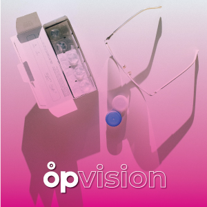
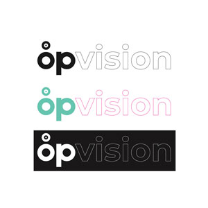
OPVision
Logo design
OPVision is a small eyewear chain based in Belgrade. The request was to conceptualize the logo that visibly remainds of the main business introducing simple graphical elements and chearfull colors.
The logo uses O and P letters from the brands name transforming them into simplified eyeglasses while the circle above the O, represents the lences. The greenish color and rose give the sensation of youth and joy.