Vicky’s Sweet Factory
Brand design, UX/UI Design
Vicky’s Sweet Factory is a small manufactory producing high quality handcrafted chocolates. Behind the scene is Vicky, a young, Belgrade based mobile developer, with a great love for cooking and good chocolate. And, he did it! He gave his passion a perfect taste!
Concept
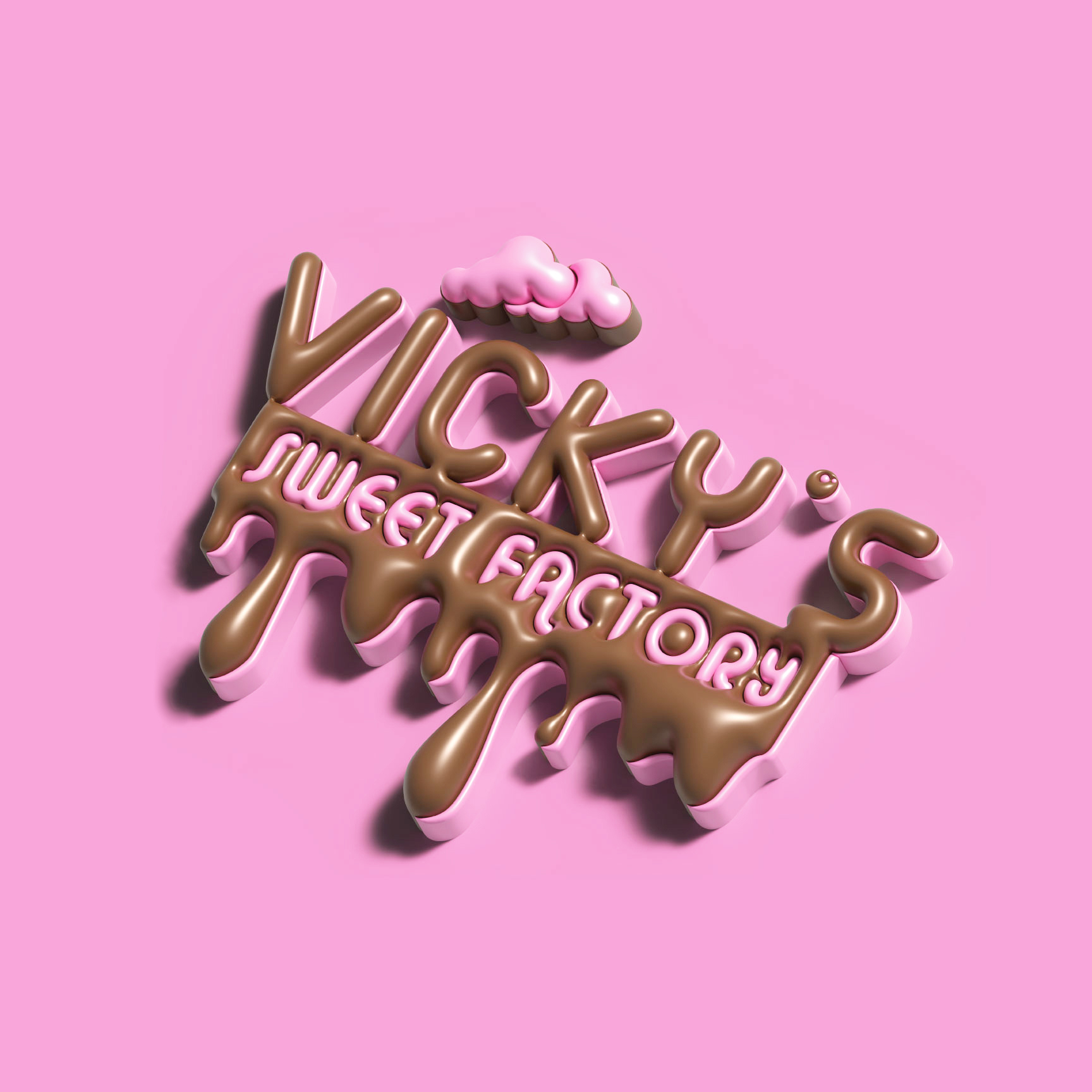
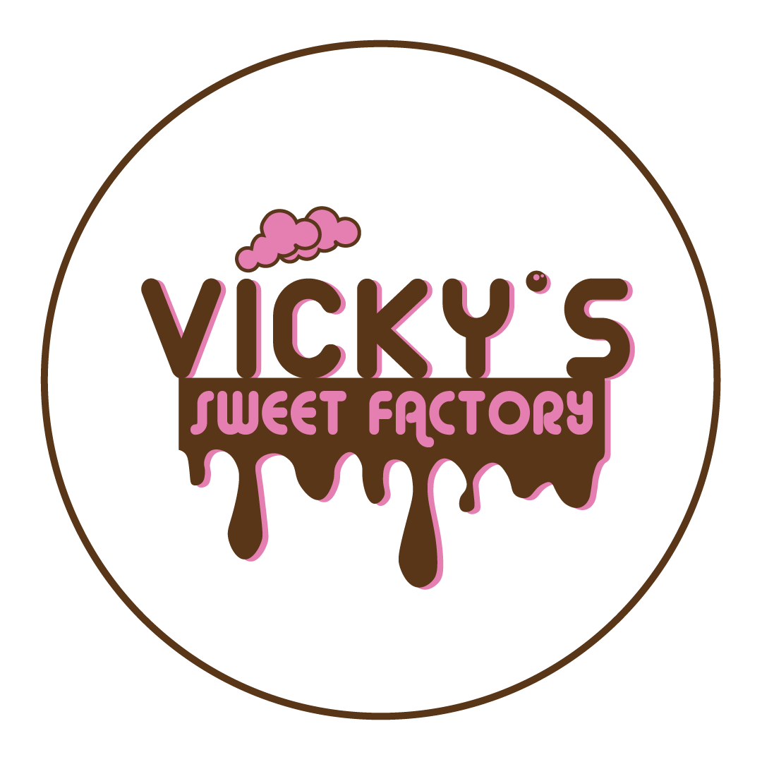
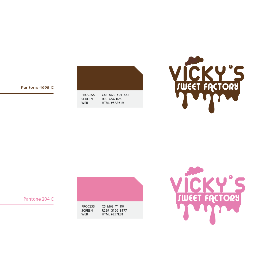
The starting point of this project was creation of an elegant logotype combined with stilized elements associated to its name. The brown color of the chocolate and rose that refers to delicacy of the flavours are combined together to give this gourmet experience a face.

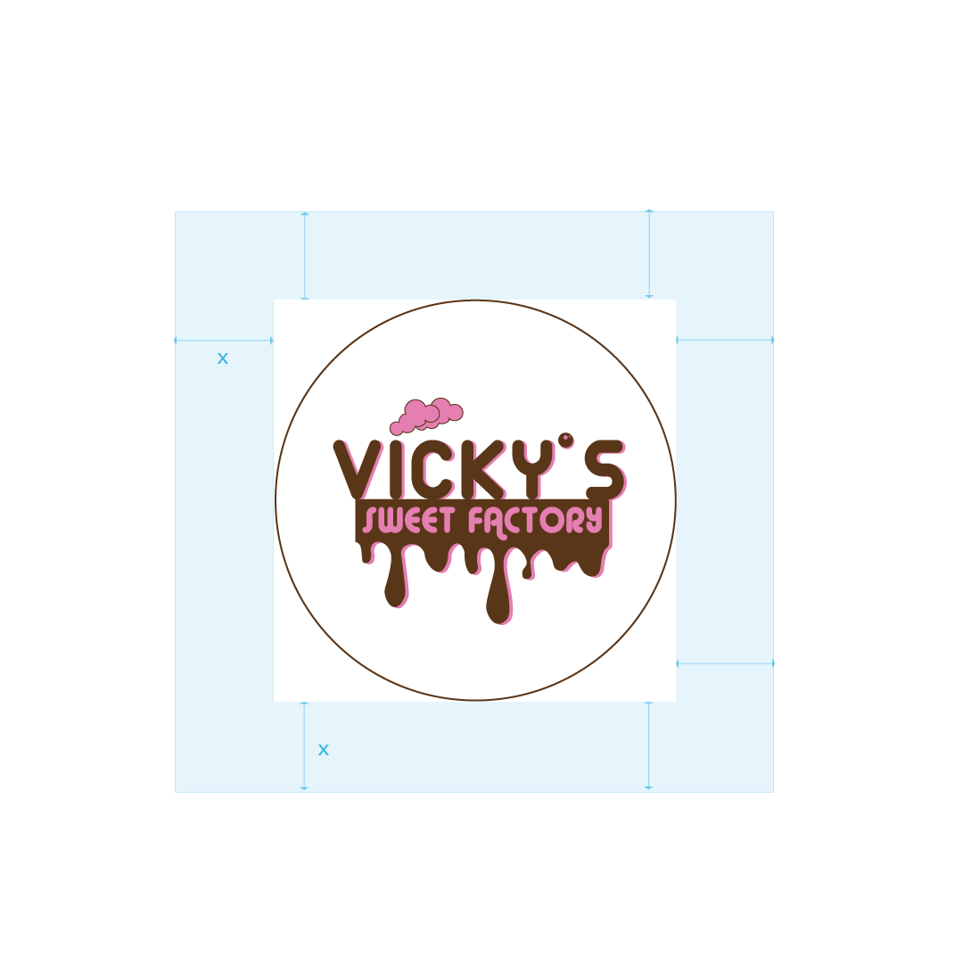
Logo clear space
Grey stripped area indicates Safe Zone. Other graphical and visual elements can be safely positioned up to the adjoining Blue area.
Blue indicates Clear Space. The blue area must be kept free of all other graphical and visual elements.
The minimum required Clear Space is defined by the measurement ‘X’ (equal to the height of the uppercase letters, known as the ‘cap-height’. The width is equal to the height.)
The Typeface Family
Only One font style is used for the logo, and it is: Alba Matter Regular.
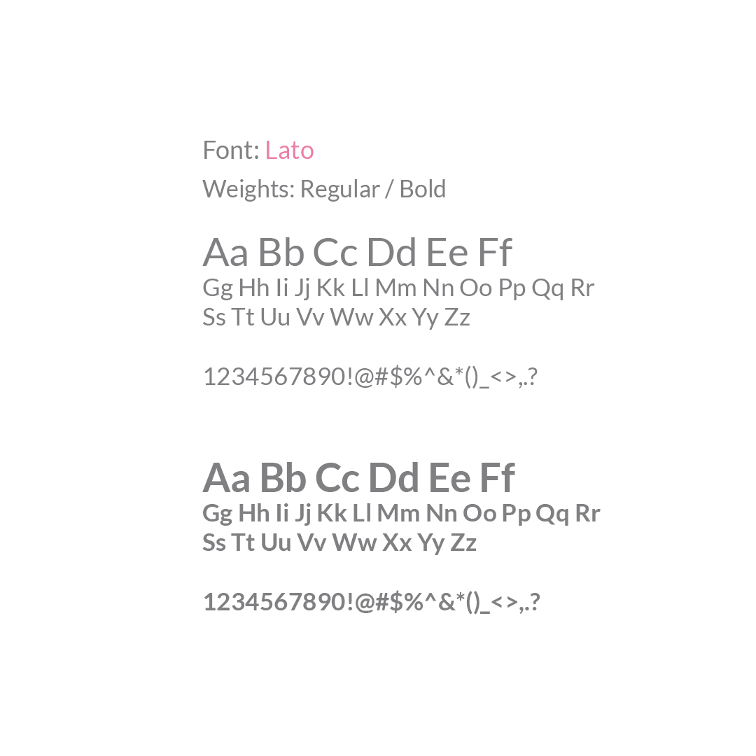
Font used on the website and in the app is Lato. Lato Bold for titles and Lato Regular for the texts.
The goal was to make simple and clean design in which the attentions is on the product images and the rest of the design is a beautiful and minimalistic wrap that completes it.
Let’s present the chocolate!
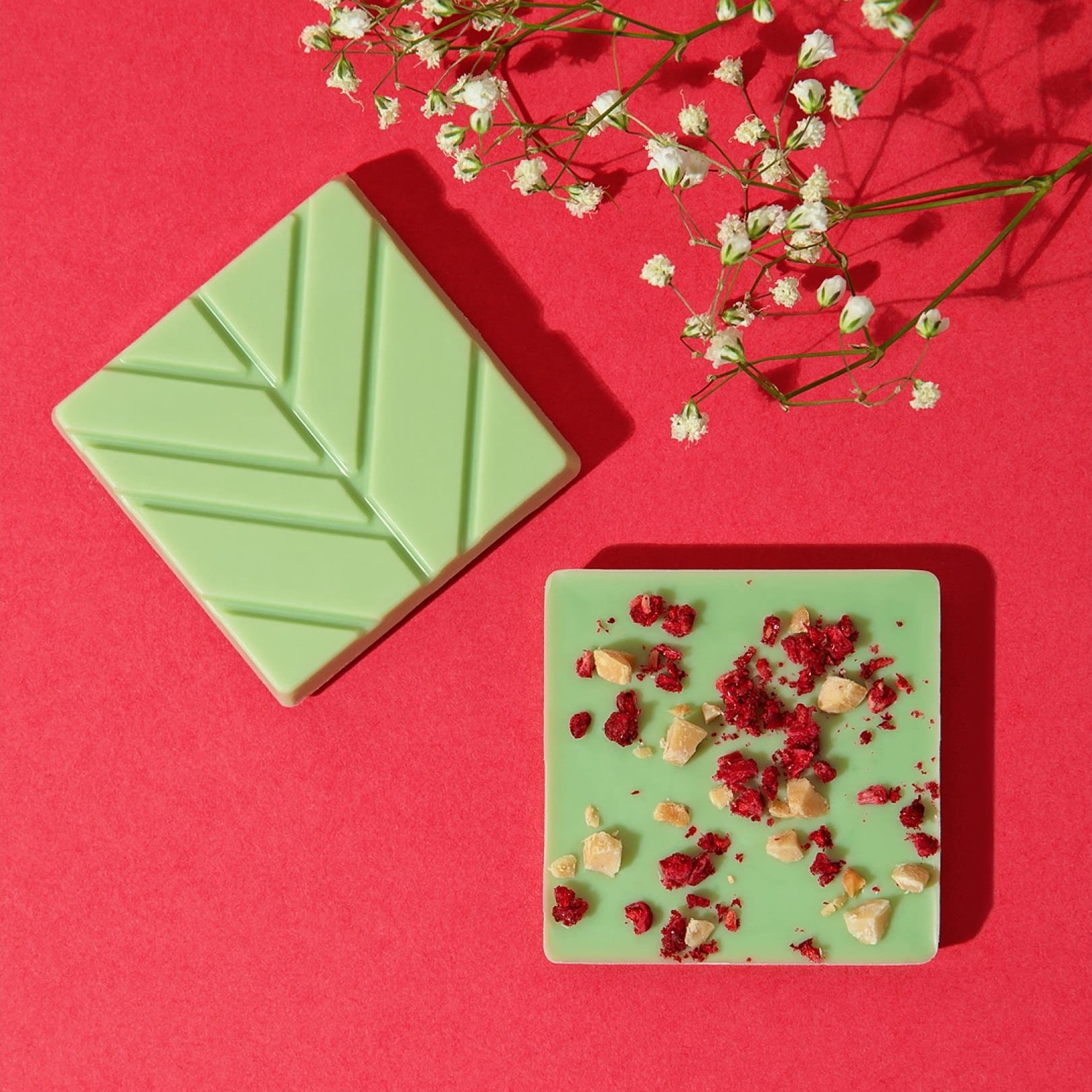
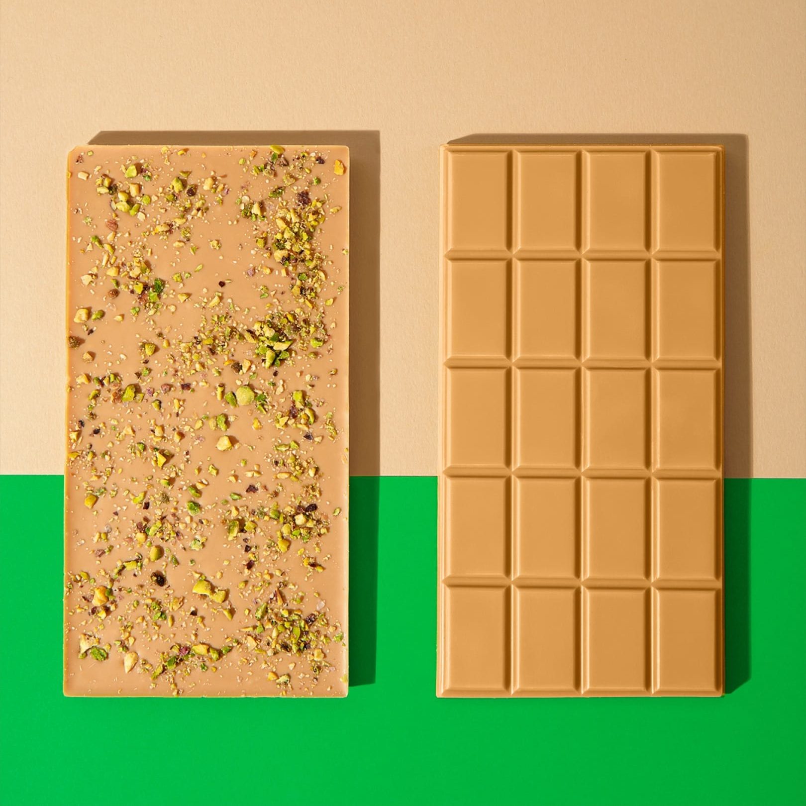
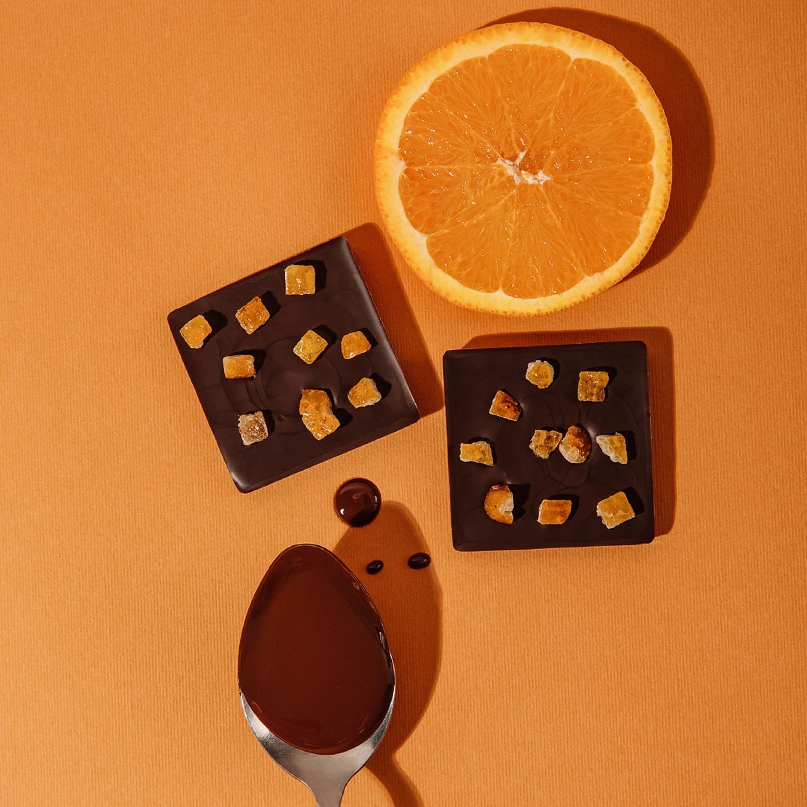
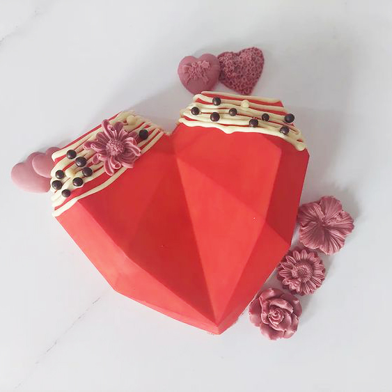
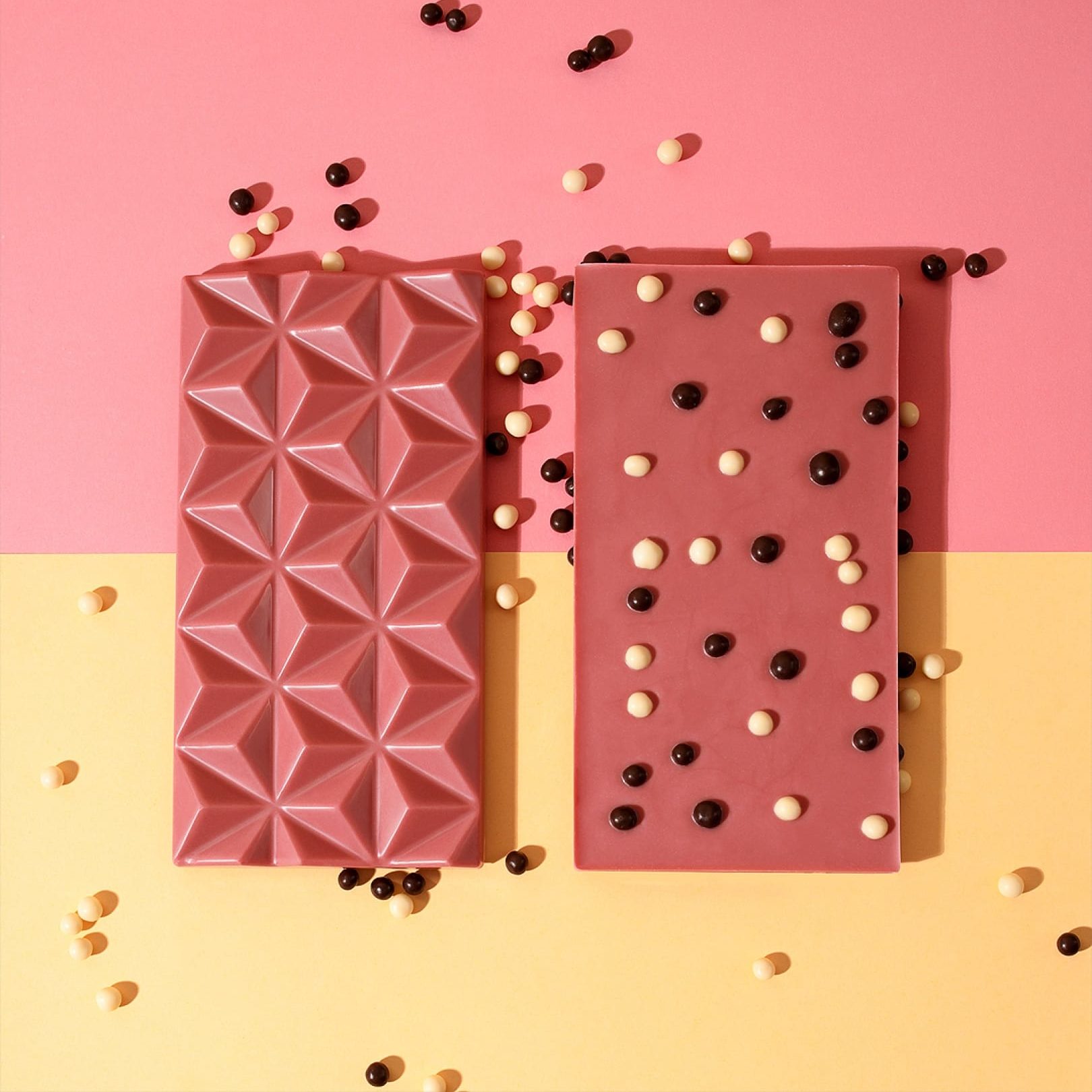
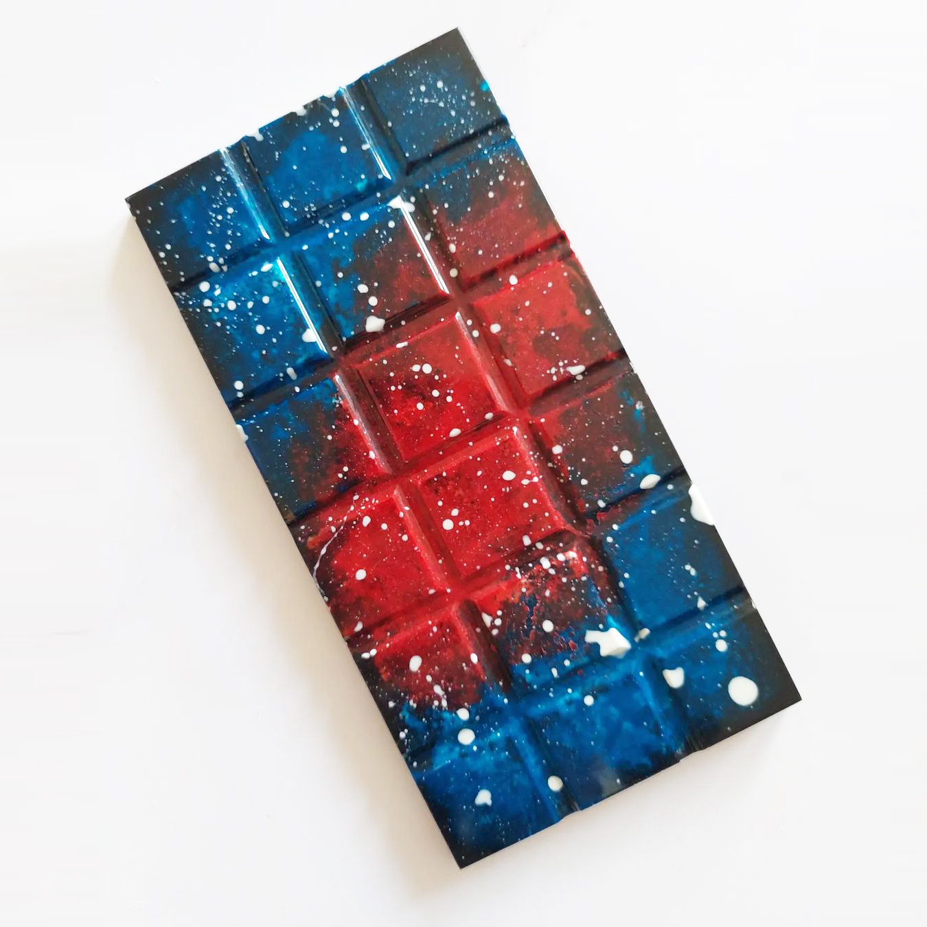
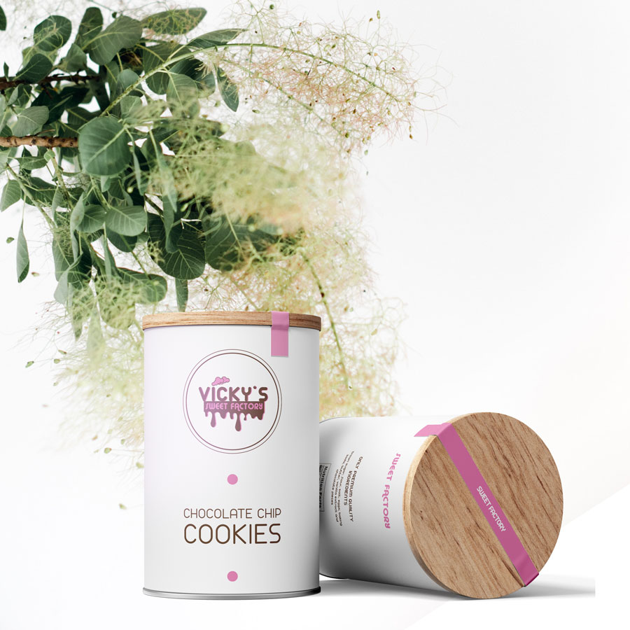
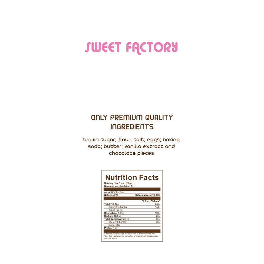
Vicky’s producing over 20 chocolate flavours, from raspberry to lavender, orange to mint and many more. And each one of them personalizzed with particular motive. Simple and effective packiging that emphasize the beauty of each product. Perfect as a gift for birthday, congratulations or as a corporate gift, as chocolate always spreads happiness. Wheather treating yourself or somone special, you will enjoy this irresistible handcrafted chocolate…one bite is never enough!
Wanna order some chocolate?
